So as some of you already know, I really really like the site thepioneerwoman.com and read her everyday. I already blogged once about a recipe I found on her cooking page, but today I was looking at her photography page and wanted to give what she suggested a try. Actually, it's what Jodi Friedman of MCP Actions suggested, since she wrote the article today. I'm kind of hoping she'll come and look at this post and tell me what she thinks! :) The article I'm talking about is here.
And for those of you who don't want to go over there and look at that, the article was about the "Rule of Thirds." I've heard that it's much more pleasing to look at a picture that isn't completely centered, but for some reason I always center my pictures anyway. So I thought I'd take a picture similar to the picture that Jodi plays around with, and do some of the same crops, and see how it goes. Maybe I'll be able to convince myself that I really should start not-centering things anymore.

Here's the original. Very much centered, as you can see. Her eyes are in the top third though, which is a good thing according to Jodi. I like that her eyes exactly follow the line where the grass and trees meet. Maybe that's just me though?

Trying to get Lily in the right third of the picture. Obviously had to cut of most of her legs (which is probably why it wouldn't have occurred to me on my own to crop it like this - getting the whole body is good, right?), but I actually do like how there is a sense that you can follow her line of sight farther. And see how long her cute hair is getting in the back.

Here I tried to get Lily's line of sight right in the middle of the picture. But because I didn't want to cut her head in half (I thought it looked funny) her eyes are almost back in the middle of the picture, instead of the right third. At least, I think. :)- I kind of like it all the same, though it does make her head look kind of huge. I do like it better than the original, actually. It's more artistic to me.

In her next example, Jodi went in really close, so I did too. I think it's cute, but I also think I need more megapixels in my camera to get this close. :) The grass and trees are starting to look a little funny.

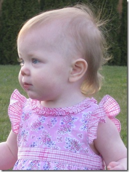
Next Jodi tried some square crops. Her first was like this, with her subject to the far right side. I personally don't like how the grass seems more important than Lily, but that's probably the Mom in me talking.

This is too close for me, even though it's not quite as close as Jodi's subject was in this crop. To me it emphasizes too much that Lily doesn't grow hair on the side of her head yet!

Vertical. Lily's head isn't as far right as Jodi's example, but that's because I don't like cropping out her soft fluffy baby hair in the back. It still has the same amount of open space though - I like it. I like how you get a little more of the ...grr can't think of the word... depth! Depth of the picture with the grass running back to the trees behind her. (Sorry, pregnant brain!)

I'm not really liking this one. As Jodi says of her example of this crop, "there's no place for your eyes to go. " And going in this close, as least for me and this picture, mutes the really pretty green of the grass into a duller shade, and I don't like that either.

Well, with a higher megapixel camera again, or just starting in much closer when I originally took the shot, this would probably be a lot better, but it looks too grainy/pixelated to me. Plus her skin just takes up so much of the space. It's not my favorite.
So, um, in conclusion... I don't take half bad pictures with my point and shoot, but I could point it a little better. I'm definately convinced that my pictures don't always need to be exactly centered. I think my favorites of all the crop is this one: 
the very first crop I made. I like that you can see more of her body, and still follow her line of sight out into more open space than the centered original. I decided I also like the picture right above this one, the very last one I did with Lily so close, just because it's really sweet, but visually it's not as appealing to me as the others.
For those of you who actually made it all the way to the end, Thanks!! Your comments would be appreciated (esp. Natalie, since you're a photographer now and all, and I love your photos!). And I'll do another post soon with more pictures of Lily that aren't all the same. :)
3 comments:
I like the same one you like, and also the fourth one down from the original. It's close, but not super close. I'm a real sucker for great photography. I'd love to get into it myself. Maybe once we have the money to upgrade my current, and rather outdated, camera. :)
Good work! like the ones cropped in close too becuase I'm a sucker for pretty sparkly eyes.
-Natalie
I like the last crop you did-the super close-up. I like seeing her face. Nice tutorial, Jefferson has been reading some similar photo improvement tricks lately.
Post a Comment